Friday, October 15, 2010
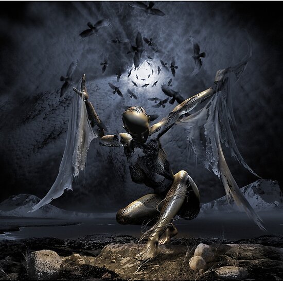
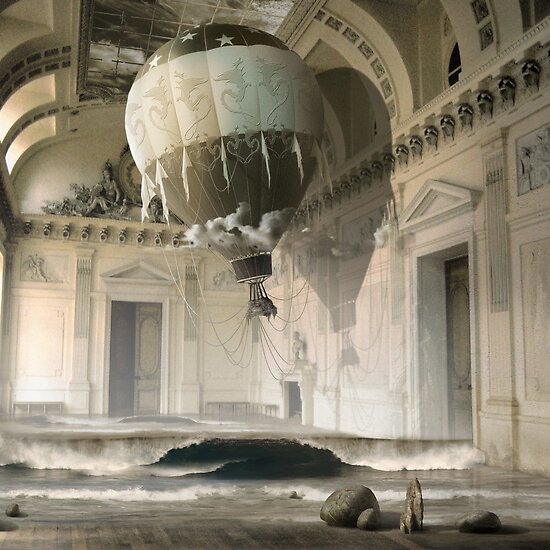
George Grie - Neo Surrealism
Friday, October 8, 2010
Project 3 - Surrealism
I chose Surrealism as my subject for Project 3. Of all the topics, I found it to be the most intriguing because of the dream-like, unusual, and sometimes disturbing images. It certainly kept my interest as I researched Surrealism in depth. The following slide is my title slide. The background features one of the most famous Surrealist paintings titled The Persistence of Memory by Salvador Dali. I went for a different background for my title slide because I felt the painting was so representative of this movement and gives a quick idea of what to expect from Surrealism.
I created a simple template for the rest of the presentation purposely because the artists works were generally very complicated. I felt simple would be appropriate. Surrealism features extremely unusual and non sequitur images. Generally, most people struggle to understand the purpose behind Surrealist art. I think this is because such art is so out of the ordinary that finding the story or message behind the image can be difficult to interpret. Once I was able to read into the art and the artists, I gained a much better idea of what Surrealism represents. The slide below shows common themes of Surrealist art.
Of all the major Surrealist artists, I enjoyed the work of Salvador Dali and Joan Miro the most. Dali's work was very versatile. Some of his works were very beautiful while some were extremely disturbing. Regardless, he was constantly catching my attention. Miro's work was quite different from most other surrealist artists as he used a variety of bright and bold colors making each image pop. The final slide below shows a piece of work from each artist (Dali's image is to the left; Miro's image is on the top).

I enjoyed doing this project because of everything I learned. I wasn't very familiar with most kinds of art, so this gave me a great opportunity to learn about something new.
Enjoy :)
I created a simple template for the rest of the presentation purposely because the artists works were generally very complicated. I felt simple would be appropriate. Surrealism features extremely unusual and non sequitur images. Generally, most people struggle to understand the purpose behind Surrealist art. I think this is because such art is so out of the ordinary that finding the story or message behind the image can be difficult to interpret. Once I was able to read into the art and the artists, I gained a much better idea of what Surrealism represents. The slide below shows common themes of Surrealist art.
Of all the major Surrealist artists, I enjoyed the work of Salvador Dali and Joan Miro the most. Dali's work was very versatile. Some of his works were very beautiful while some were extremely disturbing. Regardless, he was constantly catching my attention. Miro's work was quite different from most other surrealist artists as he used a variety of bright and bold colors making each image pop. The final slide below shows a piece of work from each artist (Dali's image is to the left; Miro's image is on the top).

I enjoyed doing this project because of everything I learned. I wasn't very familiar with most kinds of art, so this gave me a great opportunity to learn about something new.
Enjoy :)
Baltimore Museum of Art
Check out the web site for the Baltimore Museum of Art
Thursday, October 7, 2010
Project 2 - Positive/Negative Space
So I just realized we had to post our projects for CAT 111 in our blog! I'm a bit late, but my work on Project 2 is shown below.
I decided to go with a pair of scissors as I didn't want to drawn anything too terribly complicated. I honestly did not expect to come up with and images that were that intriguing (especially since there's nothing interesting about scissors); however, I was proven wrong once I really delved into the project.
I think my favorite part was deciding how to find the best positive and negative space that would give my image the best overall look. Here is the end product:
I gave the first and the last image a black background to make the overall three images flow with the white background in the middle. I liked being able to interpret the shapes, curves and shadows as I saw them. I like the last image because of the hard lines and the position of the scissors. I have to say my favorite is the second image. I tried to show the curves of the scissor handles. I enhanced this by adding the shadows and curvature to the inner parts of the handles. Overall, I really like how it's not completely obvious that this image is a section off of a pair of scissors. If viewed alone, it's an unusual silhouette and could stand on its own as an interesting image.
Overall, I'm pretty happy with the end product. I didn't think Illustrator would be so complicated at first, but once I got used to it, I wasn't as stressed out. The only thing I would fix is making some of the lines or shapes a bit more sharp.
Wednesday, September 29, 2010
Arnold Newman
Thursday, September 9, 2010
Positive/Negative Space - Hiroshi Sugimoto

I'm taking CAT 120, a Digital Photography course at AACC. In class last night, my professor was discussing different elements of composition. One of the images he showed us was by an artist named Hiroshi Sugimoto. This image caught my attention because it reminded me of the project we are currently working on for CAT 111. After doing a bit of research on this photographer, I noticed he plays with positive and negative space in most of his photographs (similar to what we are trying to do for Project 2). His work includes both simple and complex images--all of which are absolutely amazing. Above are a couple examples of his work. If you enjoy his photos as much as I do, you should check out his web site: http://www.sugimotohiroshi.com/.Tuesday, August 31, 2010
Introduction
Hello everyone,
This is my first blog, so I’m excited to experiment a bit with the design and really make it my own. I created this blog for a project in my Digital Design Foundations course at AACC. If you can’t already tell, I based my design around my favorite hobby. Photography. I’m really looking forward to adding some of my graphic design work into the mix. I’m also excited to see the work of my classmates!
I’m a recent graduate of University of Baltimore with a bachelor’s in business administration/finance, so this class is completely different from what I’m used to…and I love it! One of the downsides to finance is there’s little opportunity to really delve into one’s creativity, so I’m more than ecstatic to finally be taking some creative courses.
- Amanda
Subscribe to:
Posts (Atom)